Monday, 15 December 2014

Mock Exam Age Examples

Men, Women & Children International Trailer

Age is one of the most prominent areas that is represented in contemporary media, and how it is portrayed depends on the group being represented and the audience of the text in question. One example of age representation is the Men, Women & Children trailer. In the trailer, it shows young adults struggling with their emotions. The character played by Ansel Elgort seems sad, and angry with his life but he seems to like a girl of the same age. This creates a stereotype of young people and shows them as dependant on other people, and vulnerable to falling in love. Also, you get a sense of the boy's anger in the end of the trailer when he attacks another person. This plays into the angry side of young people's personalities, and shows that they can be emotionally unstable. I think the way that young people are represented in the trailer is true to real life, as a large portion of people that age could probably relate to the characters in at least one way.

In the first scene that you see the girl that Elgort has an interest in, the lighting is high key and natural. It is a reflection of his feelings, and shows her in a positive light. In the scenes where Elgort is talking to his counselor, or just talking about his feelings, the lighting is low-key which portrays a deep and thoughtful mood. This adds to the perception that young people have a more complex personality than maybe expected. It shows them in a more serious light than other films, and could be taken as a statement that they are different than we may have thought.

Breaking Bad- Half Measures Scene

This scene is an intense talk between Walter and Mike. It shows people of a similar age (40-60) in a menacing and superior manner. The lighting is low key and on both Walt and Mike it uses split lighting. This portrays them in a serious light. Mike talks in a slow and thoughtful way about the story he is telling, and he uses profanity in his language. This creates a certain aroma to his dialogue which keeps the viewer on edge. Combine this with Walter's worried look, and what is created is a scared, serious, dangerous feeling. The two main camera shots used both use a close up angle, with no variety between them. This helps to focus the attention on the dialogue, which is what creates the representations. 

The scene along with other featuring Mike creates a negative representation of people of his age. Although it portrays Mike in a authoritative manner, it also shows Mike as a killer, as he says the he 'should have gone all the way', referring to shooting somebody. Throughout the whole scene, Walter doesn't say much and Mike controls the conversation. After saying his final line "No more half measures Walter", he leaves the room, creating a lasting impression of his brutal yet thoughtful character.

The Sun- David Mellor Article (15th December 2014)
This article follows on from another article that 'exposed' a conversation between David Mellor and a taxi driver. Mellor used violent language and tried to belittle the driver. In this article, David is shown carrying a pink and white swirl handbag. The main text of the page says 'I've been in Cabinet, I'm an award winning broadcaster, a Queen's Counsel and.. do you like my handbag?' which portrays him as pompous and arrogant but also makes fun of him. This reflects badly on older people (of his age) because it is a stereotype that old people are arrogant and stuck up.

On the page, it also features the front page of the article I mentioned before. This shows the headline, further adding to the stereotype, as it shows that it isn't just one article. The article is over-exaggerated with the line 'MELLOR CAB SHOCK No2'. In reality, nothing bad happened in this article, but because of the wording, the audience are led to believe that he has done something bad again. 


Wednesday, 22 October 2014

Movie Poster Survey Analysis


In my gender question, I established that the majority of the results were female. This may be due to a larger majority of the class being females (the people I sent my survey out to were my class). However, there were male responses (25%) which means that I will be able to reach both male and female with my coursework pieces.


My next question asked what age range the participants were. The majority of the participants (75%) responded that they were between the ages of 12 and 16, but I can presume that they were all 16 due to them being in the same class as me. This means that I can project my posters at that age range, which is helpful because I can target a small age range.


The next question asked the participants about what features catch their eye the most when looking at film posters. A popular answer among the results was the names of the actors. Due to this, I think that it would be a good idea to include the actors names on my film posters. Another common answer was the image, which means that I will have to create a striking visual image as the main attraction of the poster.


Another question that I asked was for the participants to rank some common elements of film posters based on how important that they are to the overall poster. The highest ranked element was the main image, followed by the title of the movie. From this, I have gathered that I will need to make these two elements of my image the most striking parts, as they will draw the most attention to them.


My next question was on how much they would pay for movie poster. I left this as an open question, because I knew that people would have a wide variety of different prices. Generally the sensible prices were between £5 and £10. For this reason, I will price my poster at a price like £7.99.


My final question asked whether the participants preferred landscape or portrait orientation for movie posters. The majority (67%) answered portrait, which indicates that I should take my photo in portrait orientation.

Friday, 10 October 2014

The Great Gatsby film cover, emphasis on representation of class.


Our group chose to do The Great Gatsby, because we felt like it had a good amount of class representation in it. We chose to break the glass, because *spoiler alert* the whole plot ends in a lot of decay, and a lot of relationships being broken. We felt like a broken glass was a good visual representation of broken relationships. We also used the champagne glass because it represented the class of people in the film, which is mostly upper class. We used the bow tie for the same reason, and to represent the parties in the film. 

We decided to use the tagline 'the party's over' as it doesn't give too much away, but in addition to the image, it gives the reader a sense of what will happen, and helps to draw them in, and makes them want to watch the film.

The colour selection of the title 'The Great Gatsby' is a sign of wealth, and classiness. It helps to signify the genre and content of the film, without actually saying it. This is an effective way to let the viewers know what the film will be generally based around, without giving too much away to them.

Magazine Textual Analysis


GQ is an upper class magazine, mainly for men. It is basically the male equivalent of Vogue (published by the same company). The magazines follow the 'high class' 'well dressed' 'gentleman' style, and focusses mainly on famous and well known actors.

The main image is of Bryan Cranston, most well known for playing Walter in Breaking Bad. He is wearing a formal suit, which gives off an expensive and exclusive feel. He is looking right at the camera, which is popular in magazines, because it helps the magazine to stand out on the magazine rack, and it makes more of a connection to the reader. He has a serious expression, but he is slightly smiling, which makes him easier to look at. In his role as Walter, Bryan is known as a serious intimidating man, and this is reflected in his pose on the cover. 

The masthead is GQ's logo, which is just their name in their typeface. They use this on every magazine because it is very easily recognisable to everybody. When people see the magazine in a rack, they instantly know what it is, because it is familiar, rather than actually needing to figure out what magazine it is. It is grey, which has a connotation of the whole suave gentleman style. All of the text on the cover follows the same theme (blue, grey, white and black) and the use of similar colours helps to bring the cover together, and makes sure that is all uniform. This works because gentlemen reading this magazine will probably want to be uniform, and look smart and organised. The colours used for the cover lines are rich, and not very harsh. This suits the magazine because this is the style that the magazine follows. It also shows that is aimed at the more wealthy audience. The colours compliment each other, and altogether culminate to make a very very appealing cover.

The cover lines match the style of the magazine. The main title 'Bad Man Rising' is bold language, and is the largest text, which means it should be the main focus of the audience. The language used helps to attract the readers, as they might see Bryan Cranston as a role model, and want to see what it says about him. The text under the main title refers to Breaking Bad, so this will help to make the magazine appeal to people who have an interest in Breaking Bad. Another cover line uses an alternation between lower and upper-case letters to draw attention to the more important words, such as 'BIGGEST' and 'BRITISH FIGHT'. The use of this language pulls the reader in, and makes them want to read more. The cover uses multiple things to attract a British audience. Firstly, the mast head has 'British' in it, to show that it is a British edition of the magazine. Also in one of the cover lines the words 'British Fight' are used, which relates the magazine to the British audience.

The magazine is mainly targeted at males within the age range of 25 to 45. This is because this is the age when men are most concerned with style, and fashion. It is also not aimed at younger people, because it focusses on expensive stylish items, and younger people won't have jobs, and so they won't be able to afford the things featured in the magazine. It is aimed at the higher end of the socio-economic scale, as once again, it features expensive items, which only well paid people could afford. It would range from Group A to C1 (although even that is stretching a bit far). People who are not concerned about fashion may also buy the magazine, as it features a lot of interviews and articles about famous people and actors, who they might like. The use of strong language helps to draw readers of all groups in, so it isn't just appealing to men of the groups that I have described.


Friday, 3 October 2014

Class

This article talks about how Prince Harry has 'made a passionate plea' for the people of Britain to help support the injured service men/ women in the Invictus Games, which he launched.

In this news article, the class that is being represented is the upper class.. Prince Harry represents the upper class in a positive light, and gives off the impression that the upper class are supportive of the handicapped. Obviously this might not be the case for everybody who is 'upper class' but he still acts as a role model. I have identified this through the fact that he launched the games. Prince Harry is also being represented as very interested in the games and he seems to be putting all of his effort into making the games the best that they can be. He is also being represented in a positive light because of the purpose behind the games, for the service men/ women to not be forgotten. Wartime heroes are close to many people's hearts and because he is doing something positive for them, people form a fond opinion of him.

Gender


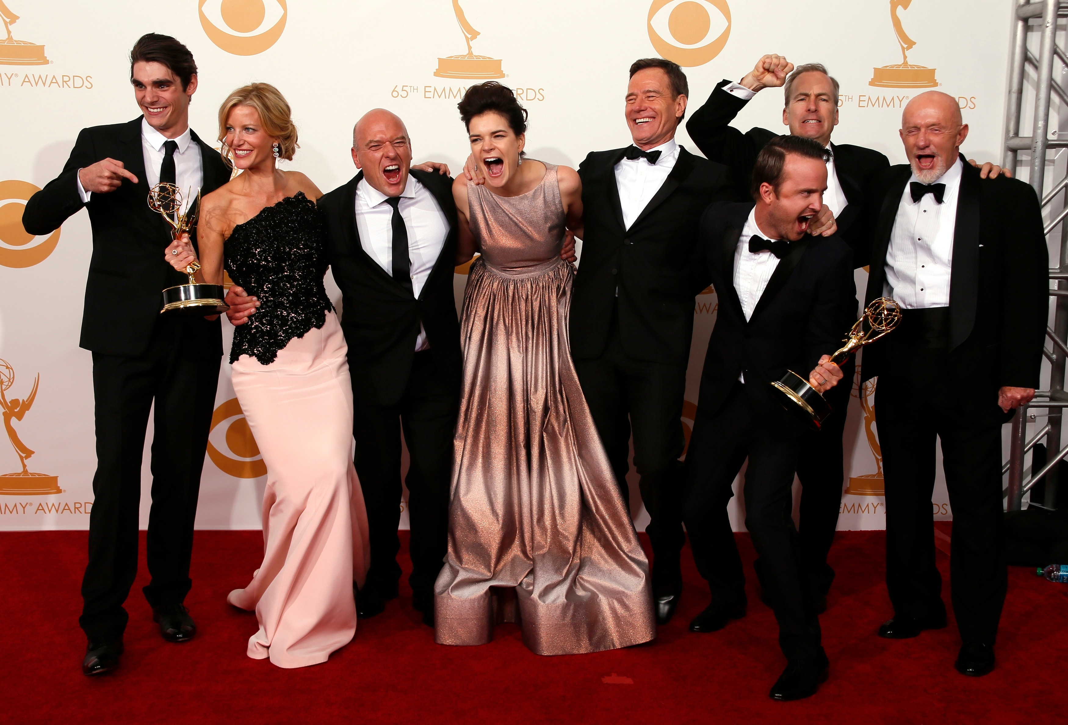
Breaking Bad is an example of a show that features dominant males. Almost every character that does something helpful in the plot, is male. This represents females in a negative light, as most of the time they are portrayed as weak, and not able to cope with the same situations that the men can. Along with this, the program also portrays males as having more criminal tendencies, as 'walt's crew' consists of males, the more powerful characters in the show are male, and only a tiny portion of the women seem to have full on criminal minds. These point both enforce the stereotype that women are 'domesticated' and 'less violent' than males.

Even though Walt's intentions towards the start of the show are to be able to provide for his family, the fact that he continues past his original goal implies that he is doing it purely out of will, and his family are no longer his primary concern.

Age


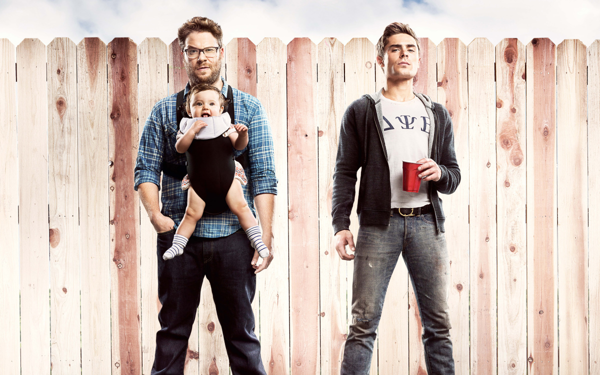
Bad Neighbours is an American comedy, released in May 2014. The film consists of two groups of people: young adults, and middle aged adults. In the film, the younger generation are the stereotypical partying hooligans. This group of people move into a house next to the middle aged generation, and cause them a lot of stress. Initially the older generation want a quiet life with their daughter, but the youngsters disrupt this. Then as the film goes on, the older generation come up with a plan to get rid of the youngsters, which involves them acting like the younger generation. This film follows the stereotype that young people are 'reckless' and 'inconsiderate' to society and also the stereotype that the 'middle aged' generation want to start to settle down. 

Race


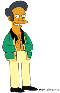
In the Simpsons, Apu Nahasapeemapetilon is represented as a stereotypical Indian that has immigrated to America. His popular catchphrase "Thank you, come again" could be argued as a racist remark, as some would say it is a stereotypical Indian phrase. He also runs the Kwik-E-Mart, a popular store, and this could also be taken as a stereotype, as many Indians run places like corner shops and convenience stores. 
I feel like this is a negative representation of the Hindu and general Indian culture. A lot of the Hindu views are represented in a negative light, and I think it isn't right that just because they are known for their jokes, the creators of the Simpsons can get away with putting such a negative view of Indians across.

Sexuality


Sexuality and relationships are explored and used widely in the TV show Friends. Over the course of the show, every one of the six main characters has more than one relationship, and the show particularly highlights the harder side of relationships. One thing the show is good at is capturing the struggle that many people face trying to make their relationships work.

Despite all the tough representations, the fact that it is an accurate representation makes it a positive representation. The fact that even after all of the hard times, the characters end up happy anyway, and this sends a positive message to the audience, which is compiled of people of all ages, race, and class.

The values of the producers are that having healthy relationships with friends is vital in maintaining a positive outlook on life. In the case of Monica and Chandler, they would've never thought they'd end up together, but they do, and they end up happier than they'd ever bee. This also sends a message that love can come from anywhere, even when you least expect. I think that this is a really important message for the producers to be sending out.

Wednesday, 1 October 2014

Textual Analysis of George Ezra- Blame It on Me


Camera:
The video starts with a camera panning from the sky down to the street, and then across as the car drives by, and stops on the two people. This is a positive start to the video, and gives the impression of a brand new day, with people driving (maybe to work). The birds at the start also signify a brand new start. The next shot is a handheld low angle. It follows him around and pans around him. A close up slow motion shot of two girls makes the audience connect and think about their emotions. A birds eye view which falls down shows the 'glitter' which hits George. This creates an interesting view on it, which is a lot more effective than just a regular camera angle.

Editing:
The majority of camera shots in this video are fairly lengthy, and slow paced, which matches the song. The shots of the two girls are slow, which puts more emphasis on their facial expressions, and draws attention to them. The shot of the 'golden glitter' is creative, and gives a different view to what would be a pretty boring shot otherwise. We can infer that filters and post editing was used to create soft tones which are easy on the eye. The look and feel of the video also adds to the soft, easy start of a new day feel. This gives the impression that he is starting a new day, and the 'yellow brick road' reference links to the fact that he has to make a decision.

Mise En Scene:
The video is set in relatively empty streets, with odd objects within them (single car with child in, golden glitter, crimes, two girls). He has his guitar and case with him, which infers that he is independent and takes music everywhere with him. The streets look almost abandoned, and as if they're a spot for crime (hence the police shoot out at the end). The gold glitter forms a yellow road at the end (referring to the quote at the start), which shows that he did in fact take yellow 'brick' road. At the start, when asked if he is sure if he wants to take the yellow brick road, he does not reply, which leave the question open. this may show that he is unsure about the decision. It leaves it to interpretation. It also adds an uncertainty to the decision, and he ultimately ends up having to go through a lot of stuff to actually follow the yellow brick path.


http://www.channel5.com/shows/secrets-lies/episodes/episode-1-676

Camera:
The episode starts with a tilt from the building down the the water, and it is slightly slowed down. The first few shots are all high low key lighting (probably created in editing), which creates a moody and dark feel to the shots. You are then shown close up shots of things in the jungle, like centipedes and spiders. The gives the viewer an eerie feeling. The slow paced camera shots are then disturbed by a fast tracking camera that pans across along with a man running. This gives a burst of energy to the show. Afterwards, it goes back to slow shots of the jungle, but this time with high key lighting.

Editing:
In the opening scenes before the title of the program, the scenes are very dark and have a blue tint to them. They was used to create a dark and almost spooky feeling. This gives the audience a foresight into what the program will be like. The title 'Secrets and Lies' is motion tracked along with the river, and used to transition into the first scene. This gives an interesting view on the title. The use of shots of the large metropolitan in combination with the jungle shots bridges the gap between the two, and creates a link between them (maybe exclusively just to the program).

Mise En Scene:
The first scenes are composed of a jungle and shows dark rivers running within in. They create a sinister but earthly familiar. Everything within those first shots adds to creating an urban, dark, nature feel. The main character Ben is dressed in his running outfit, the police and the investigators are dressed in their usual attire, so nothing out of the ordinary in terms of outfits.

Sound:
The music in the opening scenes is slow paced, dark and quite chilling. It is the kind of music that people generally associated with crime, murder and mystery, which also gives the audience an insight into the context and feel of the program. The sound is used in conjunction with the low key feel to the scenes emphasis the transitions of the shots. This adds drama to them, and helps to attract the audience to watch more. This is non-diegetic sound, as the viewer cannot see the thing making the music. Then you can hear the ambient sounds of the jungle, such as the birds and the insects, which adds mood to the jungle, and piles up the eeriness of the scenes. This is diegetic sound, as the audience can see the things producing the noises.

Wednesday, 24 September 2014

Xfactor Representations


This audition represents the boy as an energetic, good singer. The clothing that he is wearing appeals to the younger audience (15-20), and the camera angles emphasise this and the way he moves around the stage. It is quite fast paced, which matches his style.
The editors and producers have chosen camera angles which accent the boy's style. For example, the camera pans around his side, and shows off how he moves to the front of the stage. This adds the audition, and gives a perspective that is more exciting than just having the camera stationary.


This audition represents the man in a negative way. He is shown wearing clothing that is typically associated with homosexual people (which he may be), but it shows a woman in the crowd saying "oh my god", which makes the viewer laugh, and this makes a joke out of it.
The editors chose camera shots that also make fun of the man. It starts with a pan from toe to head, which shows the audience his outfit. It also shows the judge's faces, which gives a certain presentation of how people feel about him.